donderdag 29 maart 2012

Horse


I am not used to drawing from pictures, but to learn things, drawing from photos is a good thing, so I decided to use a stockphoto for this drawing. 

And I drew one of my favourite animals: a horse.

Due to the time limit, I only could draw the horse from this photo
And I started with a sketch again. 
The sketch was a bit too stretched, so I used the free transform tool to make it less long and made it a bit more compact. 
The second thing to do was to add the colors on it. So the base color was picked. With switching between different colors and defining the shape, this result came out:

woensdag 28 maart 2012

Another hand, a motor and a steampunk gentleman

Hands are a difficult thing to draw, so I decided that my hand will be the victim the next time. I will learn to draw from a real reference and I learn drawing hands. It's amazing!!

Anyway, the two previous times I discovered that I am not able to hold my hand very long, since I want to use it to use shortcuts in Photoshop. So on the sketch I defined already some shadow shapes to make it easier for me. And it worked out!


After the sketching face, I added the main flesh color, added bumps of brown shadows, defined it a bit, adding a lot of blue, blended it and continued with the blending. This hand is way better then the hand I managed to draw yesterday, so I am actually quite content with it. 
And this time, not only the hand is drawn, but also my lovely Wacom. Ow you little, adorable.... *cough* 
Anyway, my Wacom has a shiny part, so that's quite the challenge to accomplish, but after some trial and error, the final result came out. 


I know one of my weaknesses is drawing technical things. Like motors! And in stead of starting easy, I pick the most difficult image (also a drawing, but a very good drawing! Image is found here) and decide to draw it in 60 minutes. 
And this is the result:
Actually, I did this in 45 minutes (shame on me) so I had 15 minutes left. I could have added some more details, but I didn't want to mess it up, so I left it alone. 


 And the final drawing for today: Some kind of steampunkish gentleman. I wanted to draw a character with colors, so I decided to show just his upperbody with his fancy hat and his monocle. 
Sketch first again!
After the rough sketch, I drew some cleaner lines. To make it easier for me to color and because it is fun. 

And then some nice rough coloring. I kept a more painterly effect due to time and I wanted to mess with Photoshop to create a more paint-like effect. 


Tomorrow there will be more!

dinsdag 27 maart 2012

Hand, own character, hand


And tadaaaaa, here are the drawings from monday the 26th of March and the drawing from today, the 27th of March!

I was a bit fed up with the site with random ideas since the words "steel" and "hovercraft" appear often... too often. So I decided to use my own creativity and draw my own hand! And man it is hard to draw in Photoshop when you just have one hand to work with..... 
So it is a bit different I guess due to the fact that I used my hand >D

Anyway, first I started with a sketch.


And after that, I added a layer with a solid skin-colour and shaped it by adding different hues of brown and a few hues of blue. 


After the hand, lunch and other things, I decided to make something in another style again, this time, The Wind Waker style (Legend of Zelda fan? Noooooo really? ) 

It is one of my Zelda fan-characters hanging beneath a big eyeball (Vaati). But the lineart took me so much time that I didn't have the time to apply some color on it. Shoot!
So here is the lineart that I was able to creat. 


Hands are always a difficult thing to draw, so today (27th of March) I decided to draw another hand again, this time the back of my hand. 
The sketch was already "Meh!" so I am not really content with this one. It doesn't feel right. But I post it anyway. 

Well.. yeah, don't have much to say about this one. I liked the one from yesterday better, but sometimes you have a day that it doesn't work the way I want, sooooo... just have to deal with it. 


vrijdag 23 maart 2012

An old car with big spiky wheels and a demonic geisha

O boy, I've been bad! I didn't share my drawings on the same day! I am a day late!! Anyway, in this post, I will post not 1, but 2 pieces I did on Thursday! Yay!

After using the random idea generator, I found out a lot of things happened to return. That's okay, but it went a bit boring for me, so I created a mixture between the site and my own imagination. And I wanted to draw a car, badly. And that's very special, since I don't often do that. So this assignment was to create an old car with big spiky wheels. First I created some sketches and then slowly it is made into the final drawing :D


And another drawing. This time, I wanted to add a style of a certain game. So I decided to draw a demon/devil geisha in the style of Skyward Sword.

Well.... At least the blues came out as a bit of Skyward Swordish... ish... .Anyway, I am not competely content with the style, but I guess some better research should be done to accomplish that. So it is more a task when you have a bit more time on your hands.

Anyway, enjoy the drawing :D

woensdag 21 maart 2012

A reflective sheriff challenges a clockwork doctor in a rocky environment

Sooooooooooo, today it was the turn of the scene and the scene description was:
"A reflective sheriff challenges a clockwork doctor in a rocky environment".

Yeeeeey, let's draw "Cogsworth" (I hope I did write the name well... anyway, it is the character from Beauty and the Beast, the Disney version). Well, it didn't turn out like a Cogsworth, It is a combination with different things I guess.

Anyway, the sketches went first. For some reason, my energy is quite low today, so I just did 2 sketches and decided to work on the second one. The composition was more interesting then the one from the side.

After drawing the composition, I decided to sketch the doctor a bit out, just to get an idea of the doctor. 
And this is the final work:


dinsdag 20 maart 2012

A dangerous intelligent sentinel

The second drawing for today, and the cyclus start over again with a character, a dangerous intelligent sentinel. 
First of all, I searched a bit for sentinels,  but there were different meanings, so I decided the ceremonial guards would be used.
I wanted a bit more action in the pose, but when I did those, you didn't see the legs. So a bit more calmer pose was picked (however, the other one would be quite interesting to work on, o well) 
Before I used a pose which was more static, I made a bigger sketch with a perspective kinda thing. The gun would be huge and be pointing at the viewer. But as I said earlier, you wouldn't see the character too well, so this idea was dropped. 

 However, the hand touching the glasses was kept in mind to make it a bit asymmetrical. The rest of the pose is quite.. how to call it, stiff I would say. To make the whole thing a bit more interesting, some bodies were added in the bg (he is dangerous). The glasses were to add a bit of smartness (it might be a bit cliche, but it works).

And thus, this final piece was created. The sentinel standing firm with his "cute" little gun and a floor covered with blood. 


A burning alien factory with shielding

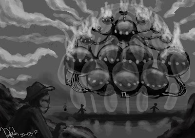
 And the second day of the week, and another drawing. This time a structure. The mission of today was to create a burning alien factory with shielding. The word alien can be seen in different ways (alien from another country, alien from outerspace), but I decided on the outerspace alien. That meant I could do anything with the structure.

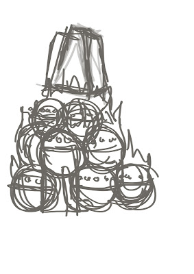
First of all, the sketches were created. I thought about spheres and big shields existing out of different smaller pieces. The spheres were struck in my mind, so I kept that idea.


When I had some sketches, I just started out with the silhouettes. A set of black circles connected with some wires. The light was added and slowly but surely some kind of UFO kind of thing appeared. When that was created, some humans and rocks were added, to give the viewer an idea how big the thing is (with the jet-skis it wasn't very clear). 


maandag 19 maart 2012

donderdag 15 maart 2012

A frozen virally-infected alien burns a bloody 4-armed king in a church, hell yeah!

The first thing that came up in my mind was "what the fudge?!" And then the challenge began!
The description fit to a drawing with action. The alien attacks the four-armed king, at least in my opinion, do I decided to make a more dynamic drawing after the first little thumbnail. So the horizon was put lop-sided on the canvas. 
The distance between the two was first quite close (as seen on the sketch at the right of the drawing). But it didn't gave the right feeling and there was a possibility that it wouldn't be clear that this person had four arms. So I made another one, the one at the bottom was the final setup. It hat a nice composition, even though you see only half of the king, it is clear that he has more arms then normal. 

Then the forms and shades had to be defined. What could have get more attention is the alien, but overall the drawing is all right. Sadly the 60 minutes flew by, so I didn't have time to add more colors. I only added the blood, to make clear the king is bloody. 


woensdag 14 maart 2012

A frozen sword-wielding waitress wearing a gas mask

Yeah.... I was really like, original for sure.
So to maintain some silhouette thingies, I sketches some small thumbnails to create a pose. I didn't worry about the look too much yet. After a few, I came to the conclusion that I should show her female-ness and that she would wield a gigantic sword. I thought the best way of showing that, was the pose in the bottom corner.

And after the thumbnail was nailed, I started to make a bigger version that I could fill with a black/dark grey color. 
Now the fun thing began! Shading, shading, how I love shading!
I started with a solid black color and drew the apron with white. The opacity of the brush was lowered (around 50% I guess) to make it less "hard". By using the color picker I picked shades and filled in the figure. The result is shown below. 


Another tricky part was to add the ice. Ice is a difficult material to draw. It reflects a lot, but contains a lot of shadows too. First I drew the ice on a layer with an opacity of 100%. I added the shadows and highlights, blended it together and then the opacity was lowered around 50%. The final result is shown below. 


A spiky organic gateway

 And another day with a new subject, this time, it was a structure. I was afraid it would be something really, really, REALLY weird, but it wasn't that weird.

The subject was a spiky organic gateway. The first thing I was thinking about was a gateway of stone, covered with plants and thorns, but it didn't work out really well, it wasn't organic. So I sketched a bit more.

The third sketch was the one (the one at the bottom). A gateway shaped like a tree, covered with thorns and roses. The "fence" besides the gate would be more trees, but with a more simple design.
The big sketch was very sloppy, but I thought the trees should have a "loose" feel to it. And thus the sketch was made.
In my other drawings I started with just adding colors. The background had a color, but the rest was just added with strokes. In drawings which take longer than 1 hour, I often use silhouettes. So I thought, why not using it this time? So I started with a dark grey, and then with white I added highlights, I used opacity, lighter greys, darker greys and such. And after all that playing with colors, I got a drawing with some nice shadows and highlights.
There was even time to give it some nice colors! So that's what I did. Normally, it would take me quite some time, because the layer style is often "normal". But I experimented a bit and this time, another layerstyle was used. (I believe it was "Hard Light") and the result is quite satisfying to be honest. 


dinsdag 13 maart 2012

A steel hovercraft carrying supplies

 And this time, the picked subject was a steel hovercraft carrying supplies. Quite the challenge for me, because I don't draw machines and other technological things. So this was a challenging challenge.

Of course the first thing to do is sketching. I started out with some writings first to get an idea. Then the small sketches were drawn.
I decided on an one-person hovercraft with supplies. It's easy, it won't get a lot of attention and it can be very fast. 
After the sketch, a clean lineart was created. This took quite some time, so the only shading added it the shading on the propeller, the glass and the "balloon-kinda-thingies". 


A weak transparent deity worships a magical old orc in a dojo

The first drawing of today with the theme:
A weak transparent deity worships a magical old orc (with thanks to the this website). 

And the first thing to do was making the sketches. Since it is a scene, there was a bit more planning needed. 
The first idea was to make a piece with a "horizontal" format, but it didn't suit my ideas, so it became more vertical. 

The first sketch (see the one above) is pretty rough. The basic poses are very important to draw. 
When I was content, the details were added and a cleaner sketch was created. 
Finally, the coloring. Since the deity had to be transparent, I played with the opacity of his layer.